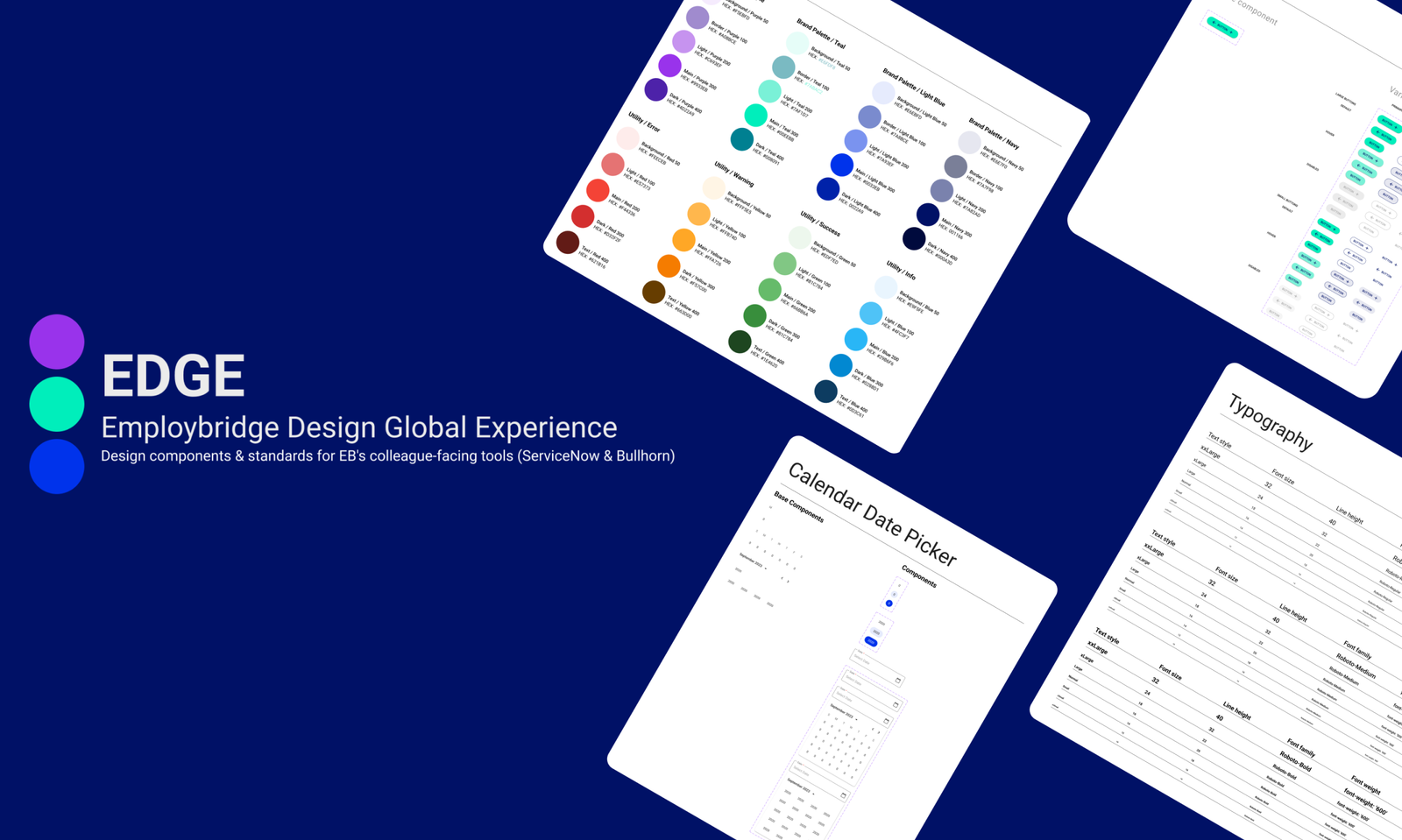
EDGE: Employbridge Design Global Experience
The Employbridge Design Global Experience or EDGE for short is a global UI kit that was developed and managed in Figma by our design team.
The purpose of EDGE was to establish the foundation for the internal Employbridge Design System. EDGE is the source of truth for design principles, guidelines, design foundations, visual components and global UI library for our organizatiion. Our design team utilized EDGE for building, designing and updating prototypes and mockups for current applications, custom platforms, and dashboards that our internal Colleagues used on a daily basis.
Why EDGE Was Built
EDGE was built because there was no current source of truth for a design library nor a foundation for a Design System. We realized a majority of designs and mockups were inconsistent in user flow and visual design. This led to applications that were developed to be very inconsistent as well.
Design Standardization & Branding
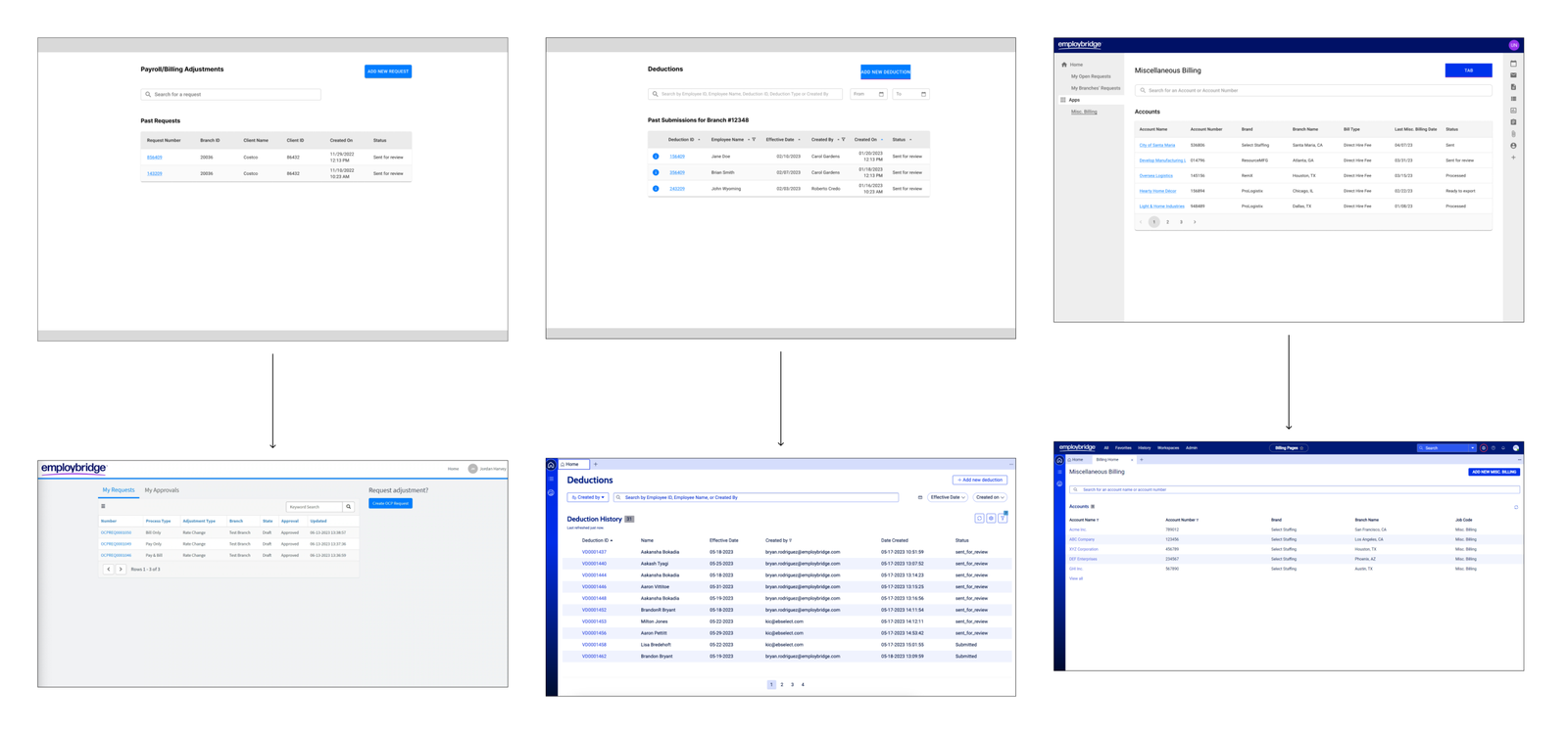
We began developing EDGE by reviewing and auditing our current dashboards, mockups, applications, and wireframes. We organized weekly working sessions to discuss on standardizing our applicatons and work including button placement, form field columns and user flows.
Once we standardized across the all platforms we worked on, we began by applying styling to our work following the brand guidelines provided by Employbridge’s marketing team. We realized though we couldn’t solely rely on the the Brand Guidelines as there were additional features, actions, and visual elements needed for our work. With this problem we began developing an internal UI kit and established a global UI library for us as designers to utilize in our current work and future projects.
Establishing Design Foundations
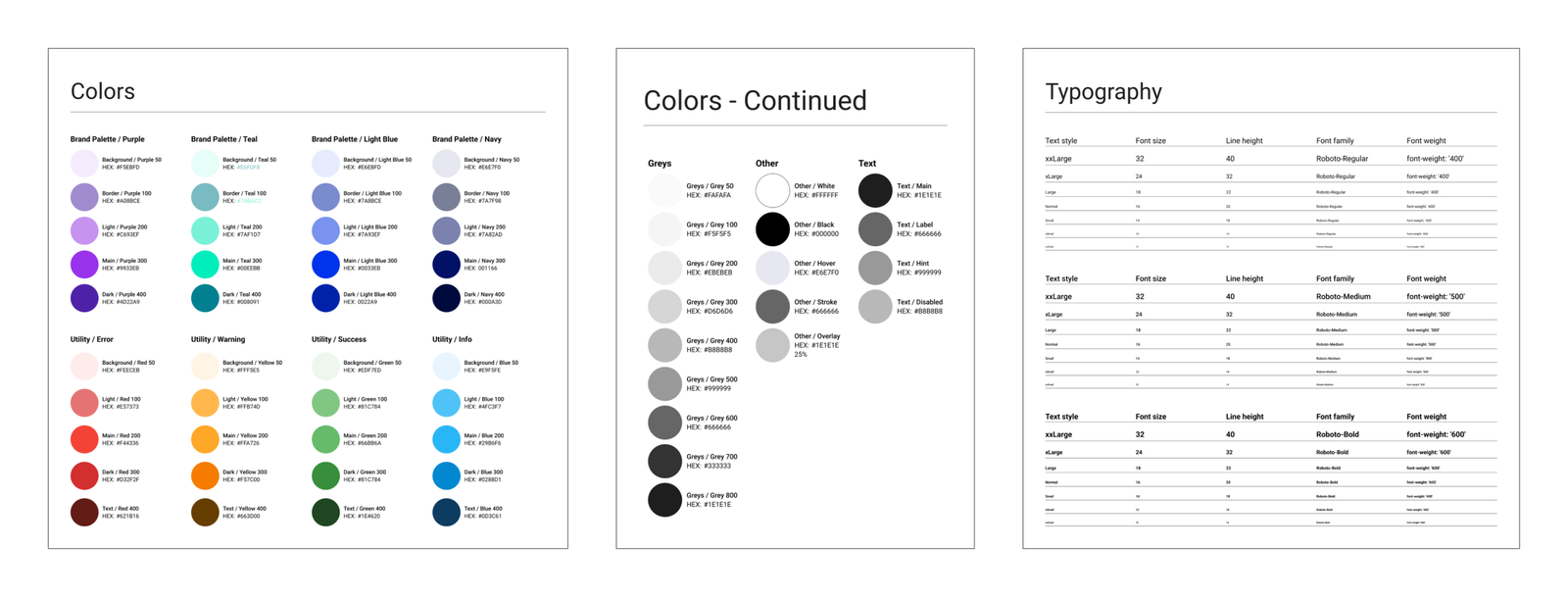
I led effort in establishing design styles including color and typography. Our design team met weekly to discuss, add, remove and approve colors and typography styles needed for our work. We also reviewed with our Engineering team to establish the foundational styles of the EDGE Design System.
Building Custom Components
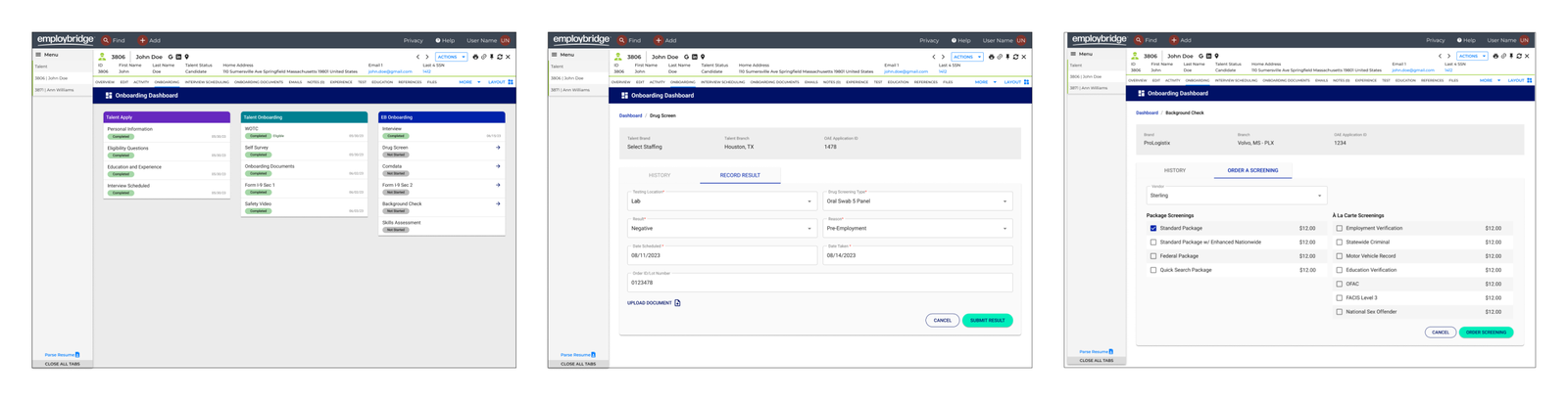
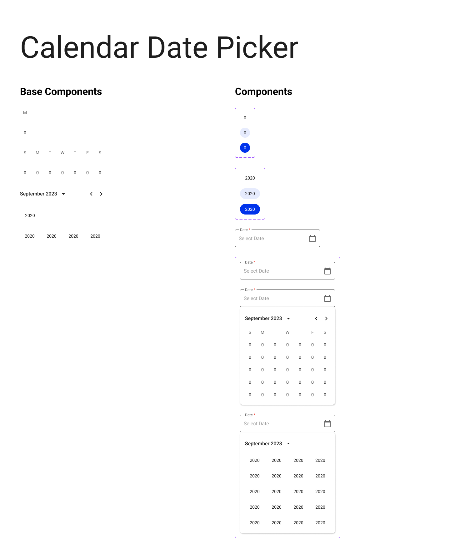
The second part of building out our library was to build custom components for our work and mockups. Originally we were utilizing Material UI to build our mockups and prototypes but in an effort to incorportate the Employbridge new branding we built out custom components, sub components, and variants in Figma with an emphasis to Employbridge’s brand. This effort allowed for visual consistency across all platforms and provided our users with an unified, consistent user experience.
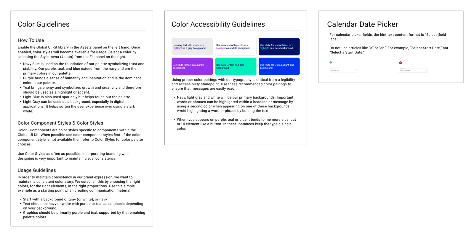
Writing out Design Guidelines
We also established design guidelines and content writing guidelines that our design team and users of the EDGE design system to follow. These guidelines would be the source of truth on how to use our library and listed the do’s and don’t’s when designing. With these guidelines we achieved consistency and among our work and designed with a unified approach.